Helping people access eye care seemlessly through online booking
Role
Product Designer
Responsibilities
Wireframing Site Mapping Userflows UI Design
Timeline
Feb. 2024 - Mar. 2024 Jan. 2025 (Homepage Iteration) Jul. 2025 (Location Expansion)
Project Overview
Problem
There was previously a lack of online presence and booking convenience which resulted in missed revenue and customer acquisition
City Optics was a well-established brick-and-mortar optometry practice but lacked an online presence to connect with a wider audience and streamline customer interactions. While potential customers were actively searching for optical services online, the business had no platform to showcase its offerings, enable seamless appointment bookings, or engage with users outside of store hours, limiting both visibility and accessibility.
Opportunity
The tempting move was to design something highly custom, tailored booking flows, bespoke visuals, to really differentiate City Optics. But the client had no in-house design or dev team to maintain that long-term, and they were already planning to open more branches. I chose to prioritise a scalable, component-based build over a more polished custom one, betting that something the client could update and grow themselves, especially as new locations came online, mattered more than a flashier first version.
Solution
We aimed to help users find the most convenient and accessible branch relative to their location and allow them to effortlessly book an appointment online, turning a phone-only, in-store business into one that could capture demand happening outside store hours.
Project Goals
Seamless booking
Ensure the platform has an accessible and easy booking system for customers to use
Scalable design
Build a scalable design that can be maintained and adapted by the City Optics team
User Research
People could find us. They just couldn't book us...
By interviewing users and observing queries online, I found that:
Understanding the problem
We conducted surveys, interviews, and a thorough competitor analysis to understand the problem and the key pain points and opportunities.
Surveys
Competitor Analysis
Key insights from research
I assumed the main issue was that people didn't know City Optics existed online. Interviews and search behaviour showed the opposite: people were finding them, through Google searches and word of mouth, but then hit a wall. There was no way to book without calling during business hours. The real problem wasn't visibility, it was booking friction. That shifted the whole focus of the project from "get found online" to "make booking effortless once you're here."
User Flows
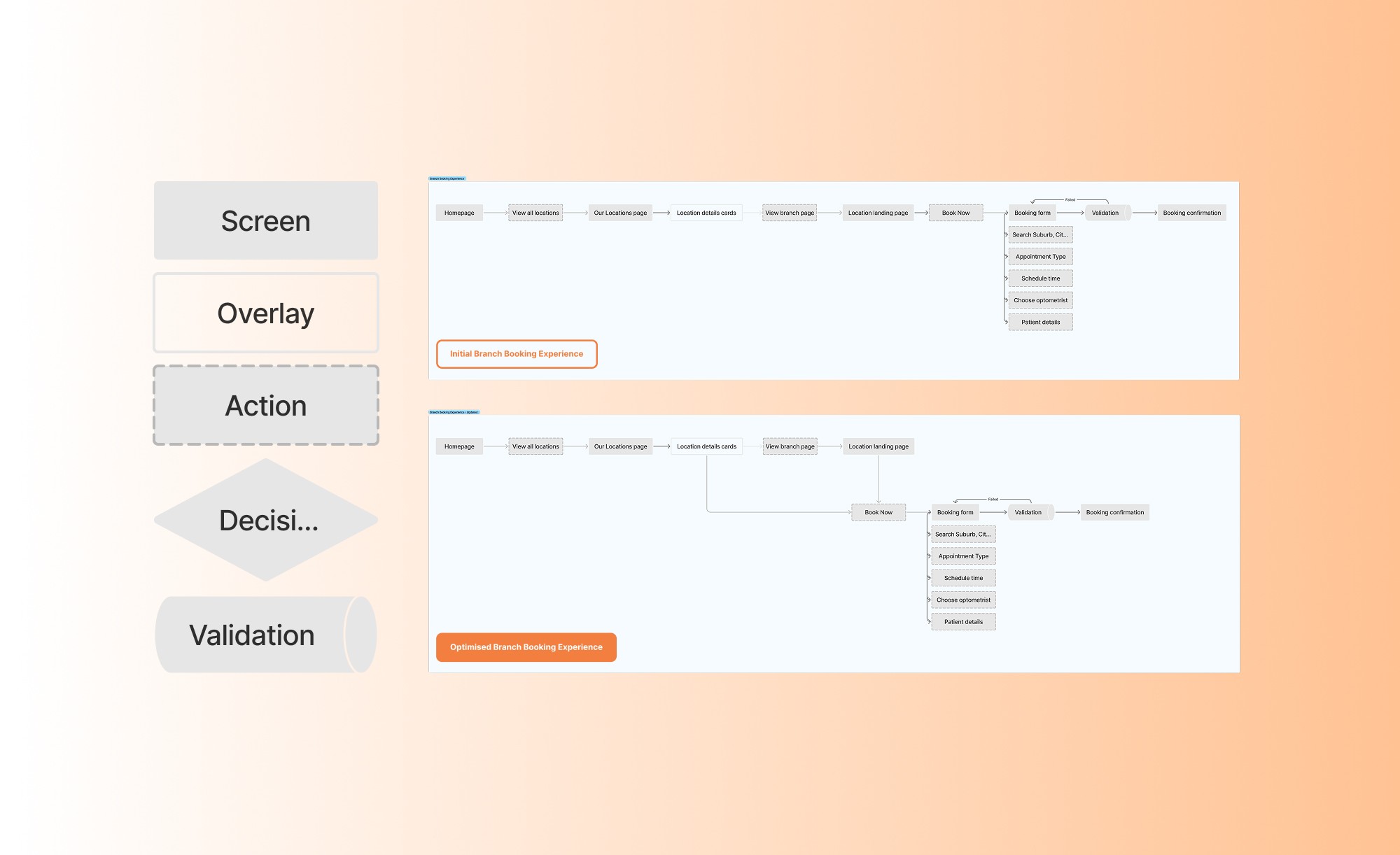
Before proposing a fix for the booking friction, I mapped the full path from homepage to confirmed appointment, to see exactly where the unnecessary steps were. The initial flow forced everyone through the same sequence: view a location, open its branch page, then start booking. Comparing this against what testing showed reshaped the optimised flow: location cards would now lead straight to Book Now, with the full branch page still available for anyone who wanted more detail first.
User Testing
Goals for Usability Testing
Content & Copy Testing
Understanding appointment types and booking requirements
To assess whether the copy clearly communicates the different appointment types on offer and what participants need to prepare before booking, without requiring a phone call to clarify.
Success Metrics
1. Comprehension Test Score (Y/N) 2. Time to correctly identify appointment type
Early Concepts
Location selection and booking process
To evalulate the duration it takes users to convert through the Book Now CTA and observe for inefficiencies in the completing the task
Success Metrics
1. Time on task 2. Click path efficiency
Participant Criteria(s):
5 Participants
1. Cohort: Has booked an eye test over the phone in the past month 2. Segment: Adults who also manage appointments for people other than themselves, e.g children, elders etc. These participants were chosen to reflect users with first hand experience booking appointments and greater scheduling responsibilities, making them ideal for testing the clarity and efficiency of the new booking system.
Usability tests we ran
Test #1
• Open up the homepage design • Navigate to the Services page • Identify the different appointment types available • Explain what they'd need to prepare or bring before booking one
Learning Goals
To test whether participants can successfully: Understand the different appointment types on offer (e.g., eye test, contact lens fitting, style consultation) and correctly identify any prerequisites or information needed before booking, without confusion or needing to contact the store directly.
Test #2
• Open up the homepage design • Navigate to the locations page • Point Out where the contact details are for the branches • Select the branch closest to them • Book an appointment for an eye test
Learning Goals
To test whether participants can successfully: 1. Navigate to the locations and booking section easily without assistance 2. Complete the booking flow without confusion or hesitation 3. Understand key information (e.g., appointment types, available times, confirmation)
Final Designs
User testing metrics
Our metrics for success
3s reduction
In average click path after relocating the CTA for branch booking
4/5 participants
Correctly identified appointment types and requirements
Reading the numbers
Relocating the CTA cut steps out of the booking flow, and most participants could correctly identify appointment types and what they needed to book, without needing to call and ask. Together, this showed the redesigned flow was both faster and clearer to act on.
Finding
Click path inefficiency on location booking
Many users scrolled through the homepage and branch page separately before finding a way to book, adding unnecessary steps to the journey.
Decision
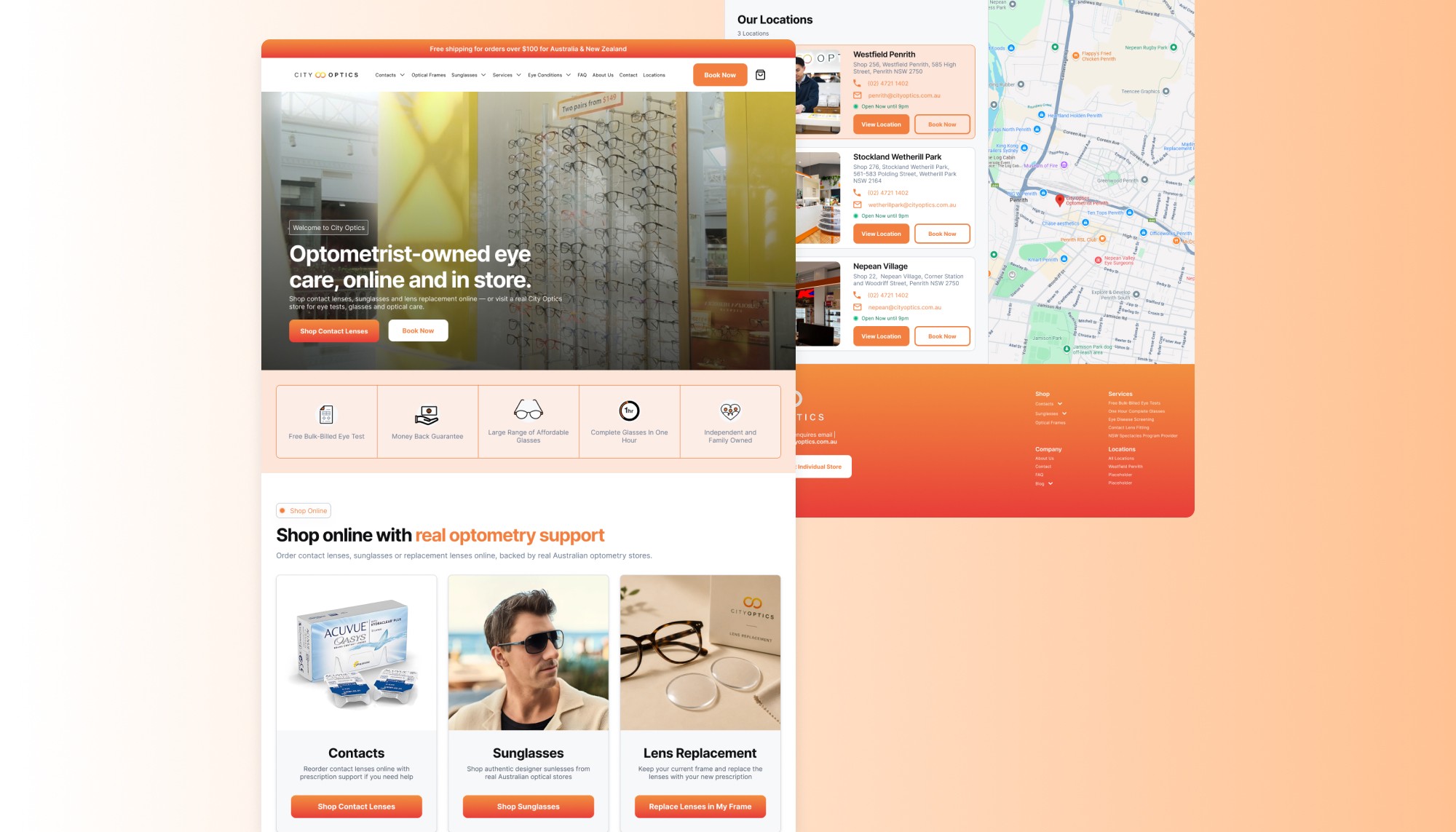
Added Book Now CTAs to location cards
I integrated Book Now buttons directly into the location listing cards, cutting steps out of the booking journey and moving conversion earlier in the flow.

Finding
Location cards lacked enough information to act on
The original cards only showed a name and address, users had no way to tell if a branch was open right now, or a direct way to book without first clicking through to a separate branch page.
Decision
Enriched location cards with live status and direct actions
I added open/closed status and both "View Location" and "Book Now" actions directly onto each card, so users could check availability and act immediately, without leaving the list to find that information elsewhere.